- Role: Design Lead
- Skills demonstrated:
This initiative was shelved due to a shift in Wiser's overall business strategy. What follows reflects the design exploration and early prototypes and not a launched product. Sorry to disappoint ya'!
Digital Shelf Intelligence (DSI) has long been a powerful but heavy tool: customers regularly access competitive KPIs like Pricing, Availability, Share of Search, Ratings & Reviews, and Content effectiveness, but only after a multi-month setup process and an onboarding process that feels broken at best.
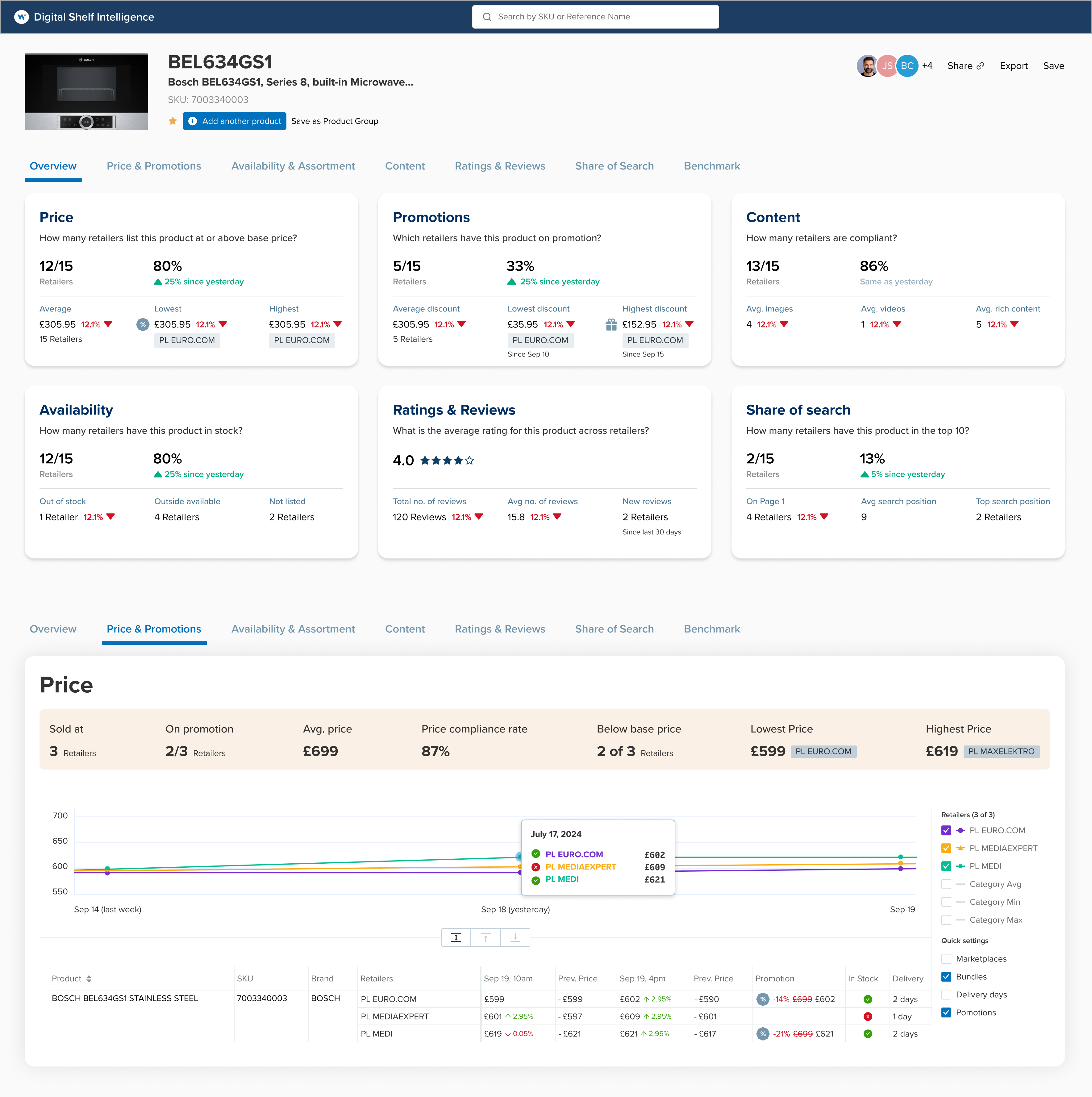
The next generation of DSI was designed to cut through the bloated model of yesteryear. Instead of waiting days or weeks to see value, let's have the user land in the product and instantly see their shelf reality: where they rank, what's working, and more importantly, what needs their immidiate attention. The vision was simple: frictionless insights, immediate impact. Whether it's a brand manager checking price moves or a digital shelf lead validating assortment gaps, the experience should be fast, contextual, and obvious.

Challenge
Legacy DSI workflows were tuned for enterprise sales cycles: lengthy onboarding, custom dashboards, and manual configuration before any insight could be delivered. That meant customers often didn't feel the product's impact until well after contracts were signed.
In today's market, this was untenable. Teams needed to see KPIs on day one, not week eight. The challenge was to rebuild the experience around speed to value without losing the analytical depth that made DSI trusted by enterprise customers.
Understanding the requirements
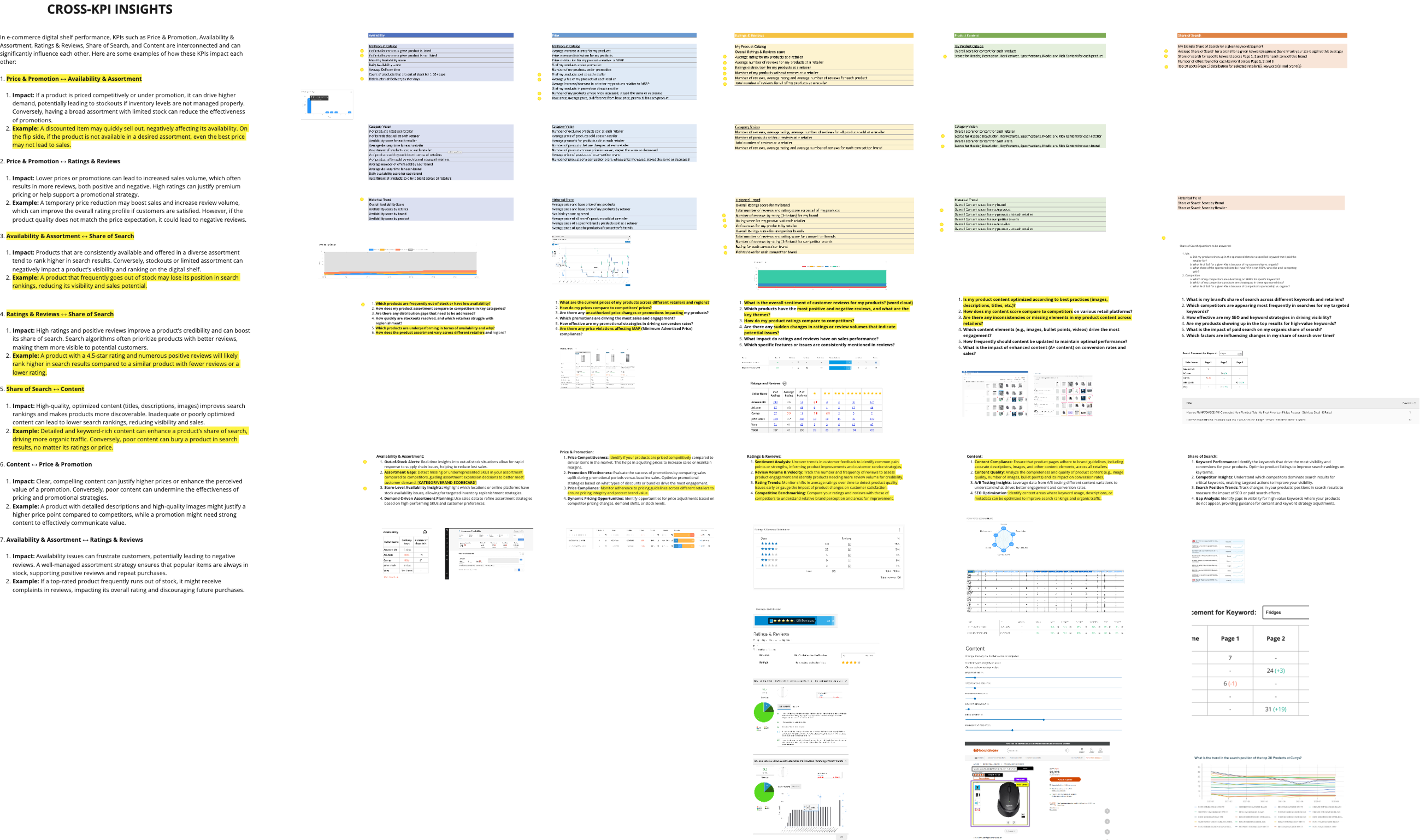
Through discovery sessions with Ops, CSMs, and product stakeholders, we clarified what “value” means to DSI customers. Adoption depends not on features alone, but on how quickly users can see movement in the digital shelf KPIs that matter most:
- Price & Promotions: are we priced competitively, and how do promotions impact conversion?
- Availability & Assortment: are products reliably in stock and widely distributed?
- Share of Search: how visible are our products compared to competitors?
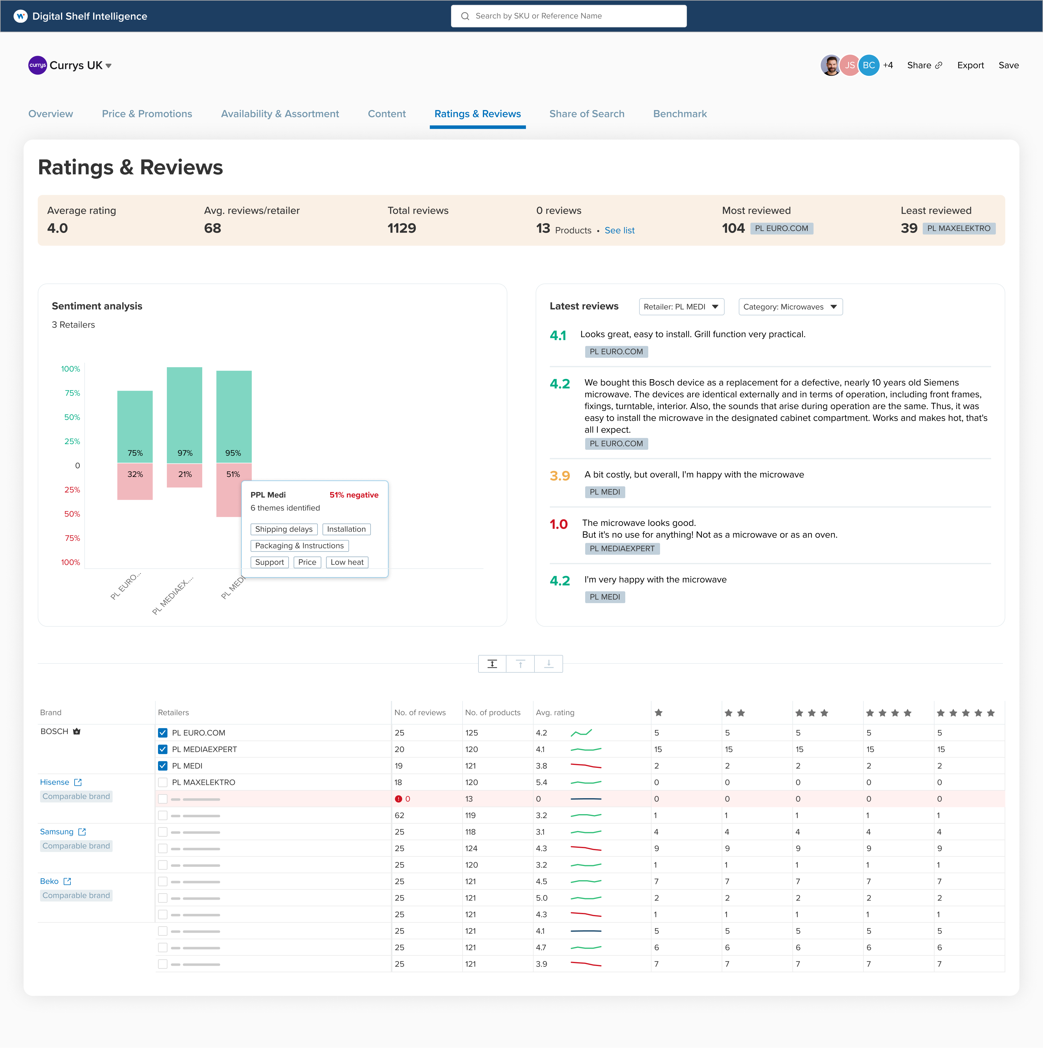
- Ratings & Reviews: what do customers think, and how does sentiment affect conversion?
- Content Quality: are titles, images, and descriptions optimized for discoverability?
We also learned that these KPIs never exist in silos. Discounting can drive stockouts, which tank availability and search rankings. Strong ratings can justify higher prices. Weak content can bury products no matter how competitive the offer.
Finally, we mapped out the four contexts in which customers actually reason about these KPIs:
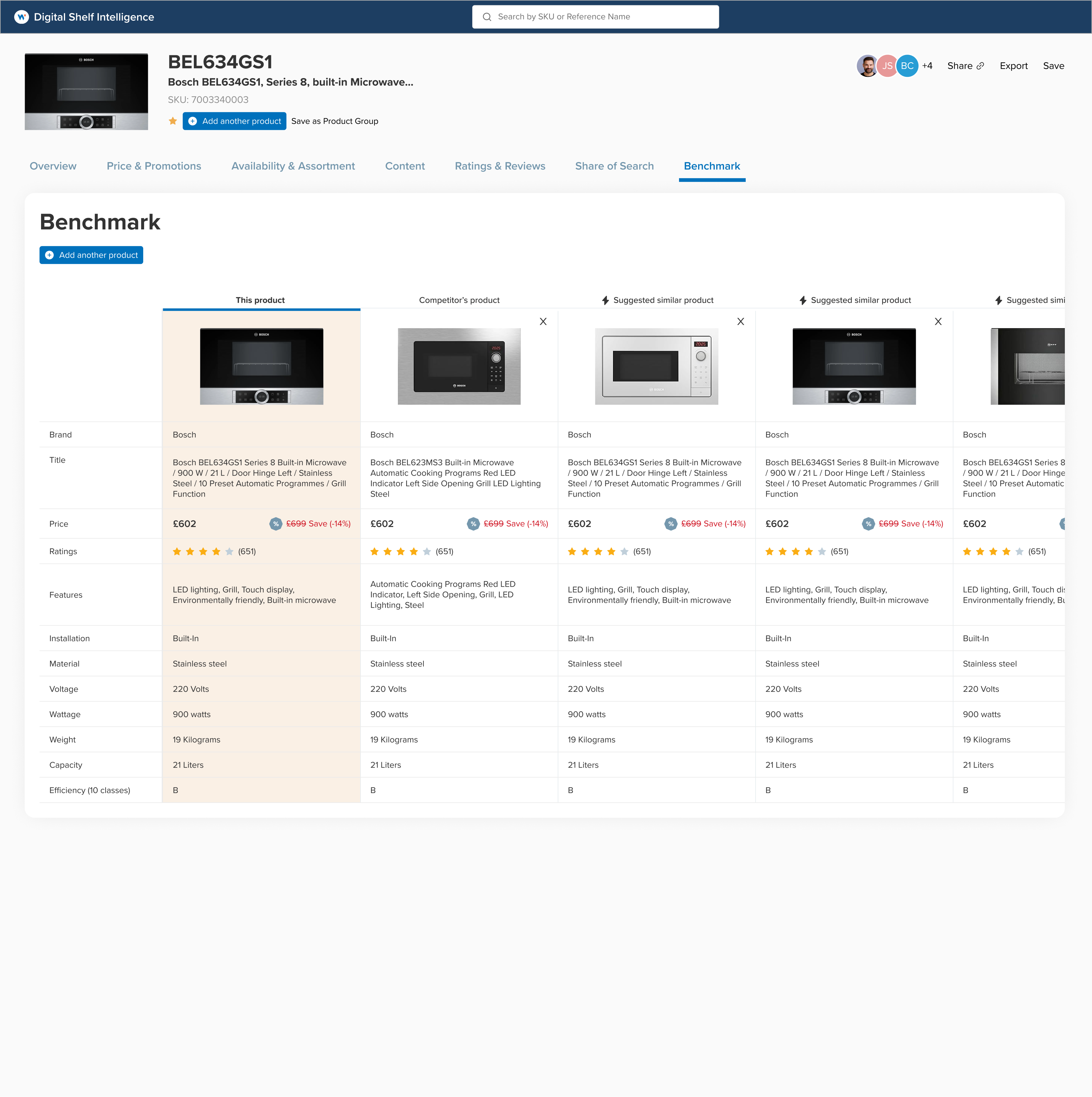
- Product level: to see how an item performs against others.
- Category level: to understand the broader landscape.
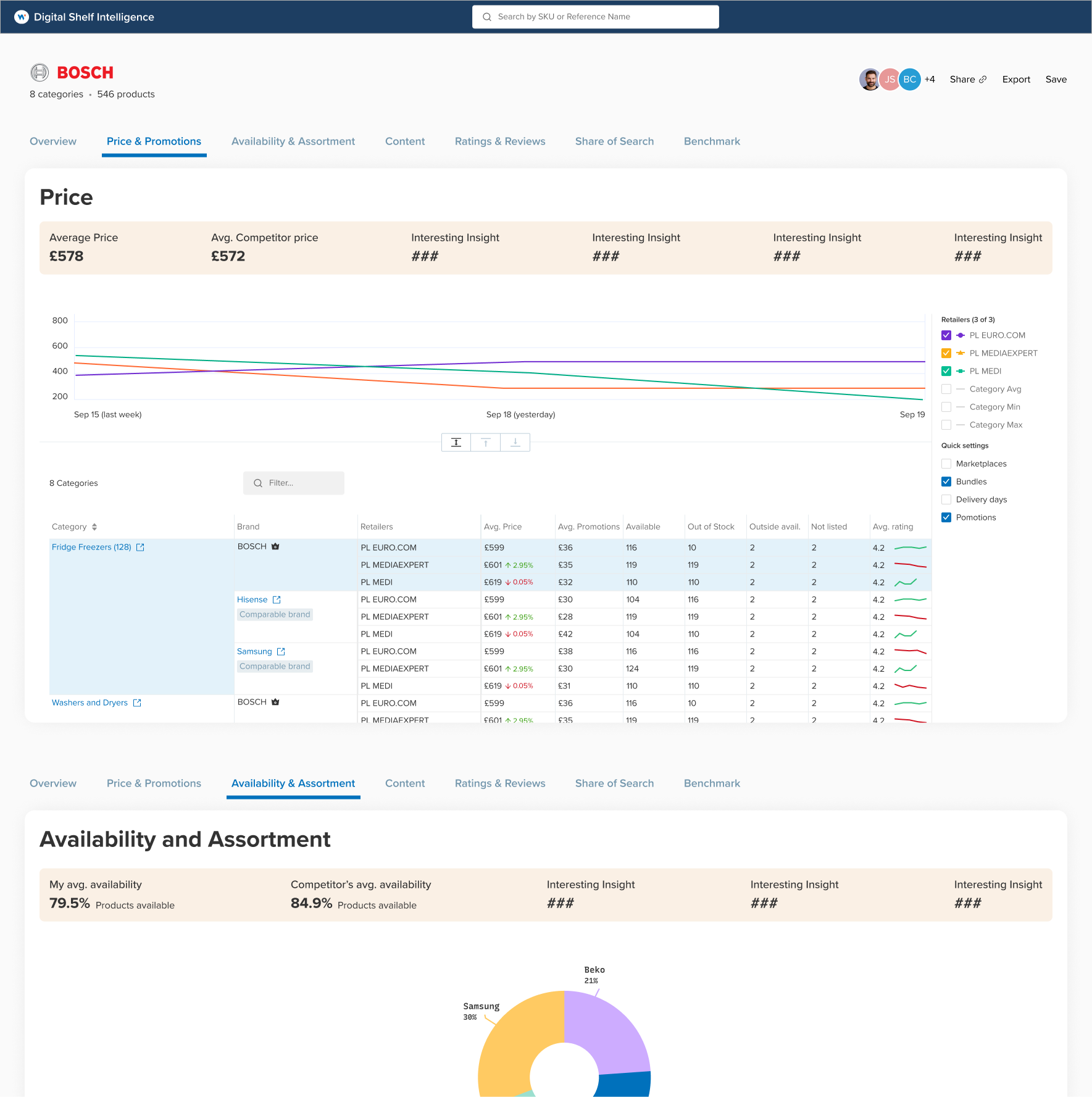
- Brand level: to compare against competing brands.
- Retailer level: to benchmark one retailer's performance against another.
The requirement was clear: the product had to surface both KPIs and their relationships, across all these contexts, connecting actions (like launching a promotion) to downstream effects (like losing search share due to stockouts).
Solution direction
The next-gen DSI was solutioned around 2 key principle: make insights fast & relevant; and make the user feel like a superhero in front of their team. To get there, we explored four core directions:
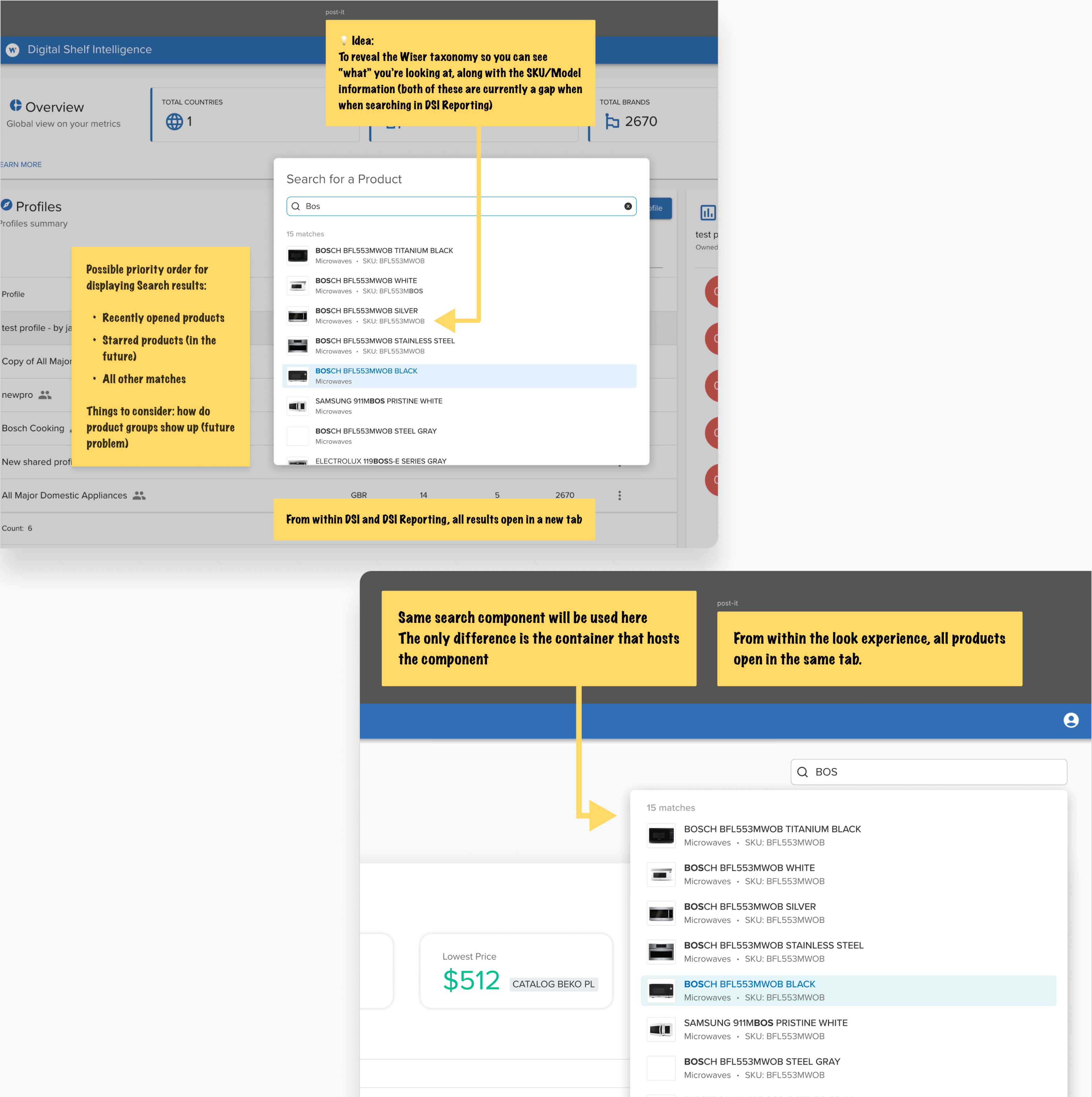
Contextual by design
Insights were tailored to where the user was working — whether at the level of a single product, a product category, a brand, or a retailer. This kept information relevant, actionable, and easy to trust.
Ready to go experiences
New accounts would land with pre-built dashboards and reports instead of empty states that left users puzzled. This reduced setup time and created an immediate sense of value.
Anchor everything to outcome
Anomaly detection and natural-language summaries surfaced the changes that mattered most. Everything worked in cohesion to get users to their first and subsequent wins — prioritizing outcomes over friction.
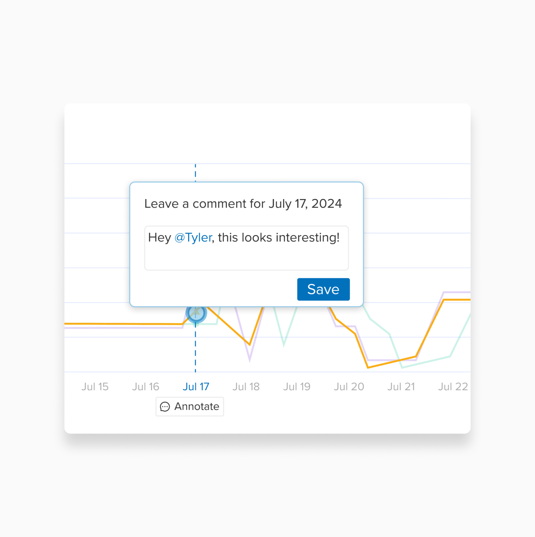
Collaboration at the core
Shared dashboards and data-sharing tools turned DSI from a single-user reporting tool into a shared workspace. Adoption could spread within teams, and existing users looked like superheroes in front of their colleagues.
This initiative was shelved due to a shift in Wiser's overall business strategy. What you just saw above reflects the design exploration and early prototypes and not a launched product. Sorry to disappoint ya'!
Want to learn more?
Wiser is doing some amazing things in the online retail analytics space. Take a look at their website
Pssst! Case studies feel too formal? Check out Absurd Designs...
No process. All mischief.