- Role: Design Lead
- Skills demonstrated:
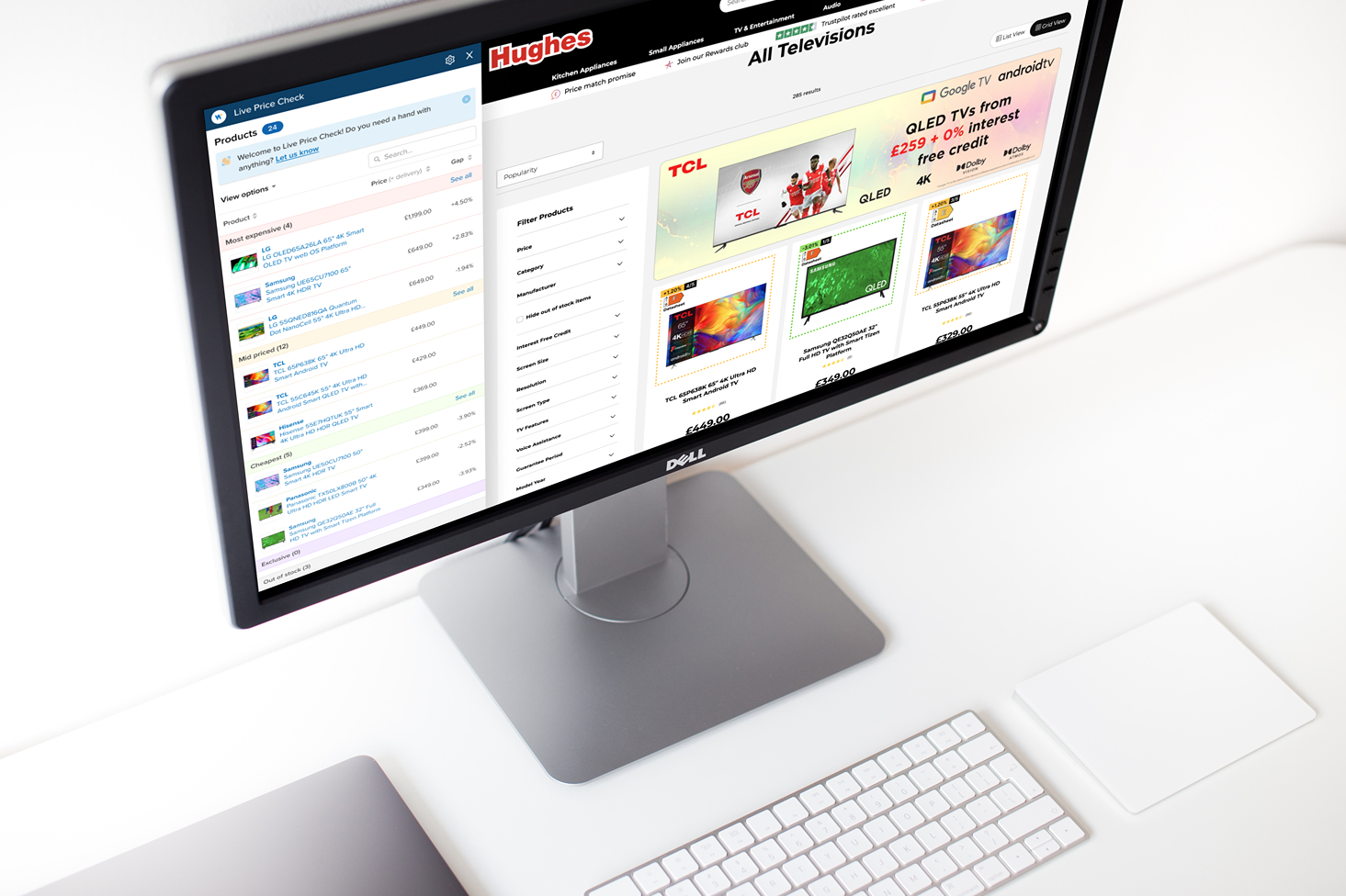
Live Price Check is a Chrome extension by Wiser that surfaces real-time competitor pricing and availability directly in the browser. Its goal is simple: make competitive intelligence instant and actionable for brands and retailers.
Challenge
Live Price Check (LPC) was originally built as an enterprise sales offering, with a heavy onboarding cycle that buried its biggest strength: instant contextual competitive intelligence. What should have been immediate was hidden behind weeks of friction.
To unlock its potential, LPC needed a different approach. A Product-Led Growth model made sense because it put the product in users' hands first — no contracts, no long setup, just self-serve insights in minutes. If competitive intelligence could be delivered instantly, adoption would follow.
Results
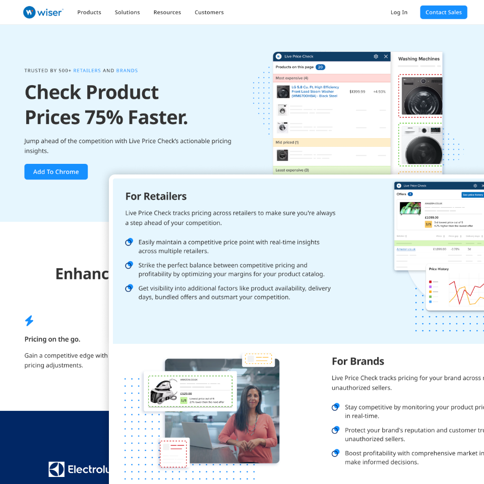
Improved landing page
Improved landing page design drove an 81% increase in clicks on the primary CTA.
Time-to-value collapsed
Setting up LPC was reduced from 30+ days to < 2 minutes thanks to a self-serve consumer-friendly signup experience.
Increased leads
In less than one month, our hand-raiser experiments led to four separate 6-figure sales conversations.
Solution
To move LPC into a Product-Led Growth model, we focused on one key principle: reduce friction at every touchpoint. That meant rethinking how users discovered, signed up, and learned the product, and how we engaged them afterward.
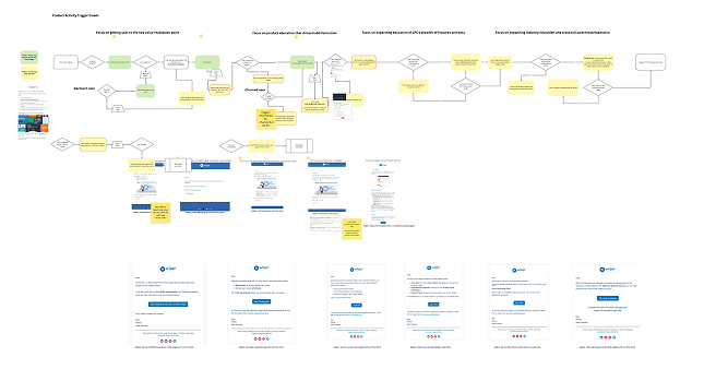
We mapped the journey against the PLG framework, focusing on the most relevant stages — awareness, acquisition, activation, and engagement as stepping stones to our immediate goals.

Solution 1:New landing page and self-serve sign up flow
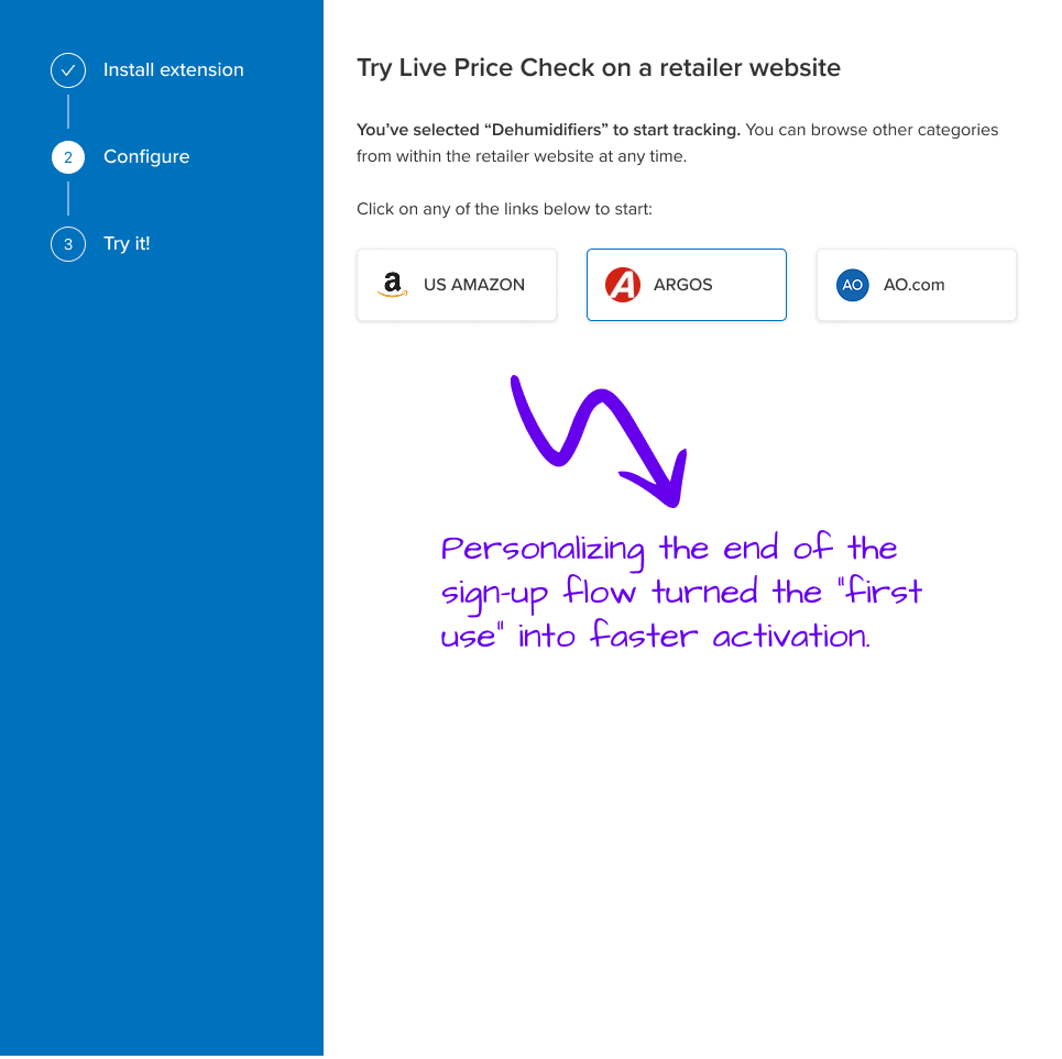
Previously, access to LPC was gated behind sales contracts and long onboarding cycles. We introduced a new landing page to drive awareness and set clear expectations, paired with a self-serve sign up flow that let users install the extension and get started in minutes with a free set of retailers. Together, these changes removed the biggest bottleneck in the journey and allowed users to experience the product's core value immediately.
Solution 2: In-product prompts & surveys
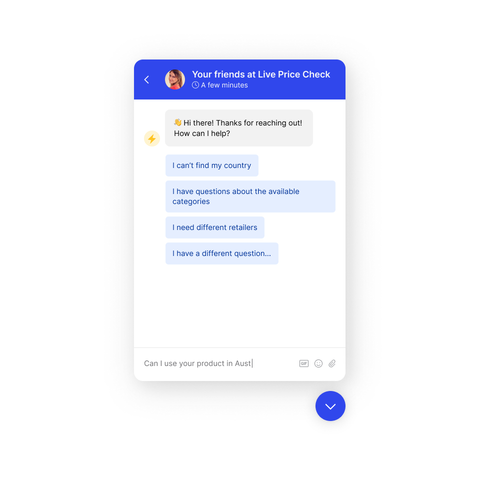
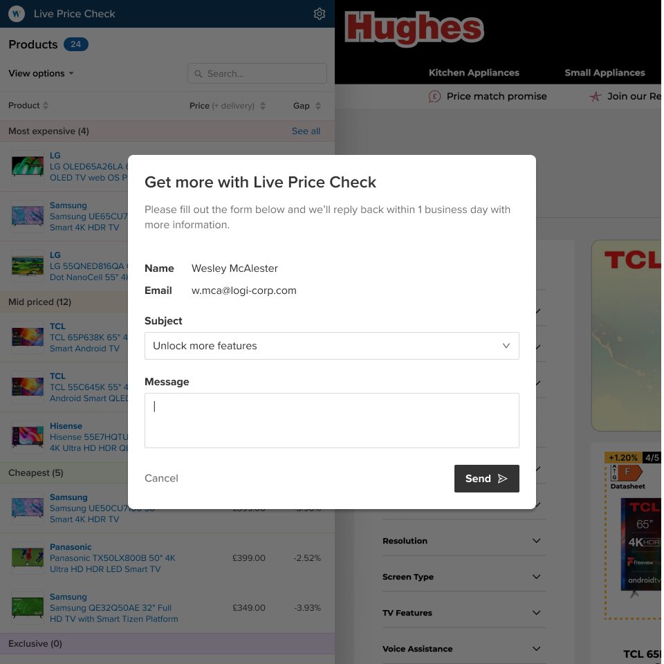
We added lightweight hand-raiser prompts inside the product. Instead of blocking adoption, these prompts let users explore freely, while still creating a natural moment for sales to step in when users expressed interest.
In parallel, we introduced short in-product surveys to capture feedback at key moments in the journey. These gave us a clearer picture of where users were finding value (or friction), without pulling them into long research sessions.
The team explored a range of options here: from technically demanding ideas like chatbots and custom components to lightweight in-product nudges. For early experiments, we intentionally chose the simplest approach to validate whether users actally cared, while leaving room for richer implementations in the future.
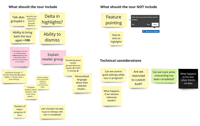
Solution 3:Improved onboarding tour
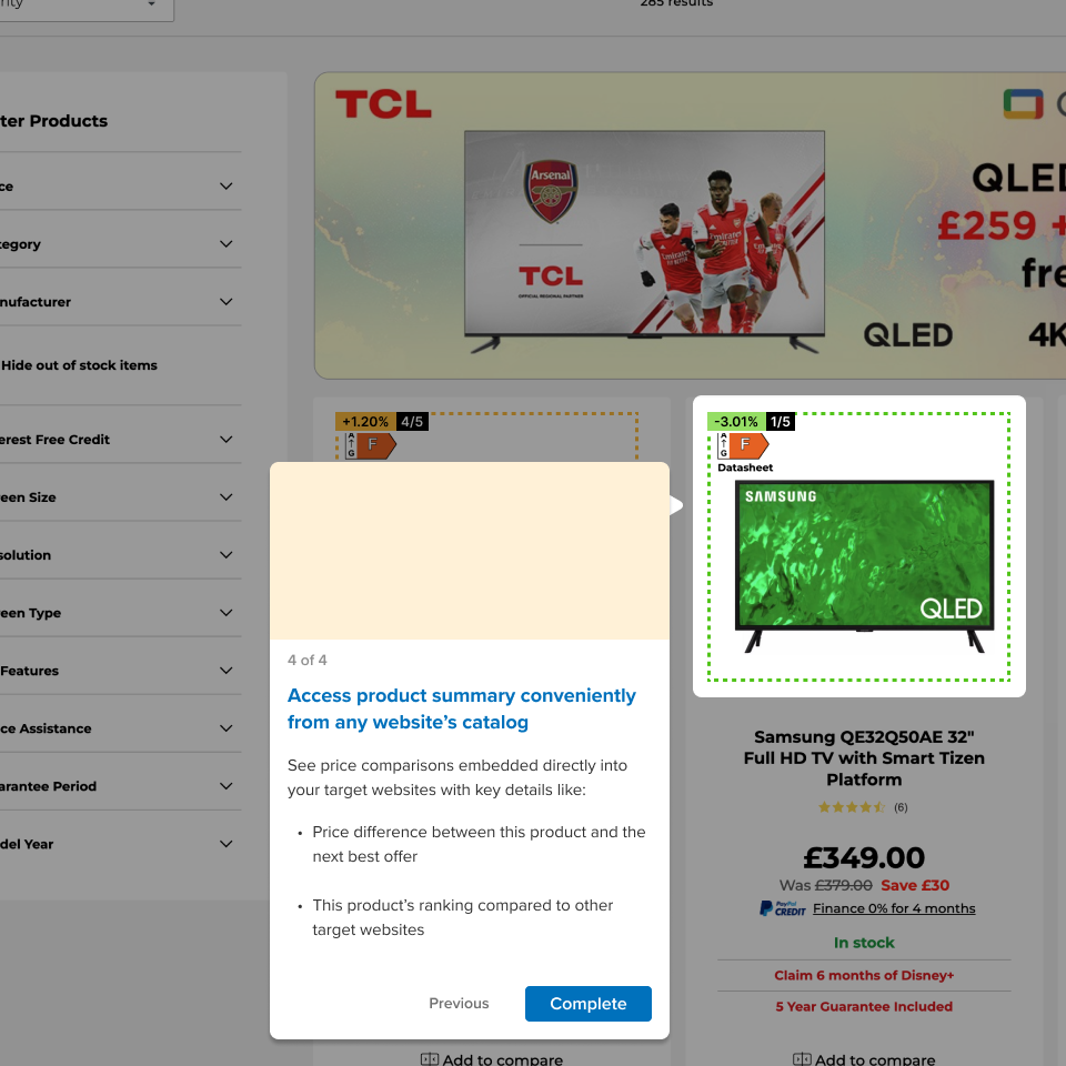
The original onboarding tour was built with expectation that users would be trained buried users in steps before they saw any value. We redesigned the onboarding tour to focus on immediate wins: showing live competitor pricing in-context within the browser. This helped users connect the extension's promise with their daily workflows right away.
Solution 4:Consumer-facing communications
Adoption didn't stop inside the product. We introduced drip email campaigns highlighting tips, use cases, and quick wins. These communications reinforced the product's value, encouraged return usage, and created a bridge between trial users and longer-term adoption.
Iterative experiments
We weren't chasing polish, only signals. The team leaned into a “small experiments, shipped quickly” mindset. We finished small iterations fast and watched analytics to decide next steps.
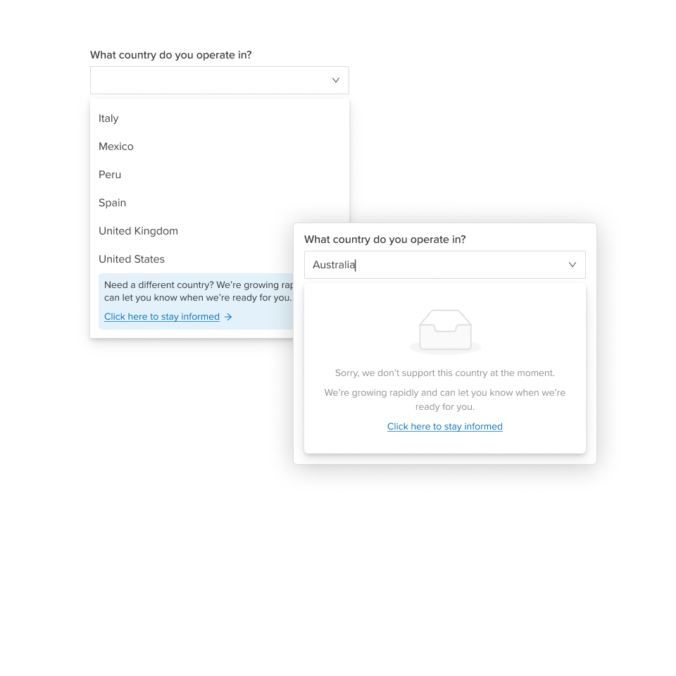
For example, our first self-serve sign up flow asked for user details upfront so we could follow up in case they dropped out. But when users hit blockers (unsupported country, industry, or retailers), it only added to their frustration. We flipped the order: configure first, capture details second. This meant fewer leads, but a truer picture of customers who would actually get value from LPC.
We tracked progress through Pendo & Storybook, and aimed for lean experiments wherever possible. To catch edge cases we couldn't serve yet, we bolted on a Google Form via a “Need something different?” link. Elegant? Not at all. Rapid? Heck yea!
Reflection
The biggest shift wasn't in any single feature as such — it was in how we worked. Moving from "big launches" to "small signals" forced the team to get comfortable shipping scrappy, learning fast, and iterating in public. Not every experiment stuck, but the rhythm of quick cycles pulled the product closer to the PLG promise: value first, contracts later.
Want to learn more?
Wiser is doing some amazing things in the online retail analytics space. Take a look at their website
Pssst! Case studies feel too formal? Check out Absurd Designs...
No process. All mischief.
