- Role: Lead UX
- Skills demonstrated:
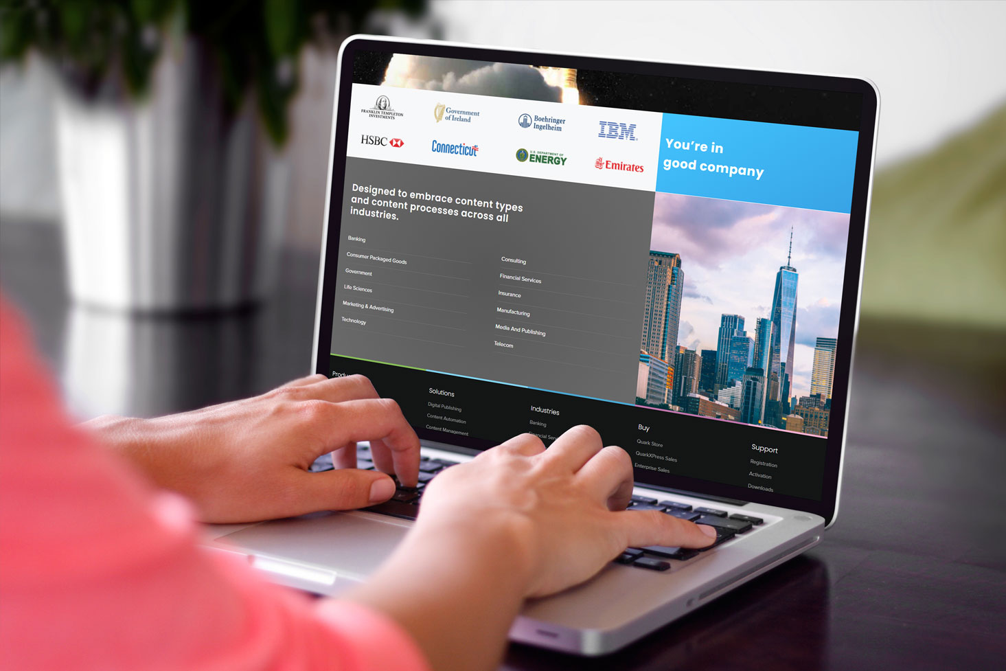
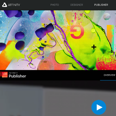
Quark.com sees, on average, about 200K visitors a month. This is the story of how we went through a complete overhaul of its tech-stack and design language to launch a re-branded website with a new focus on customer aquisition, a deeper sales funnel and highly-targetted analytics.
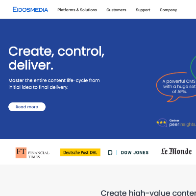
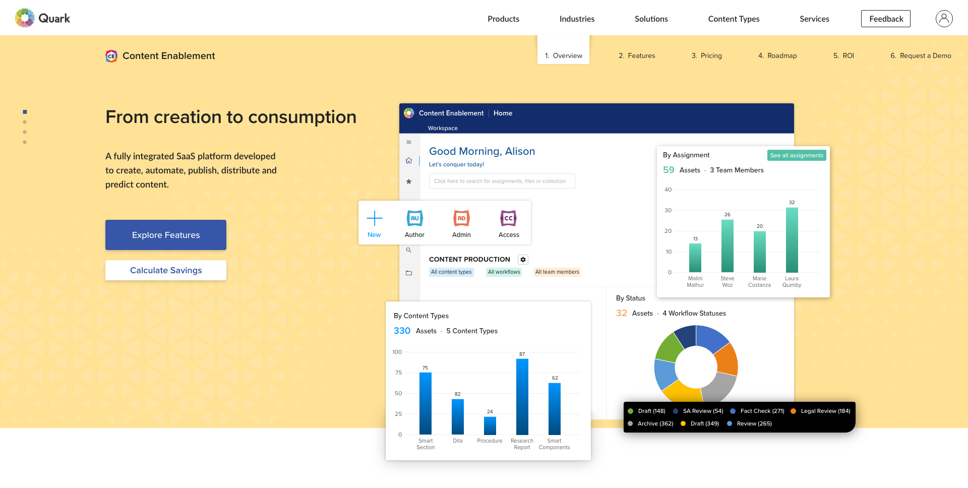
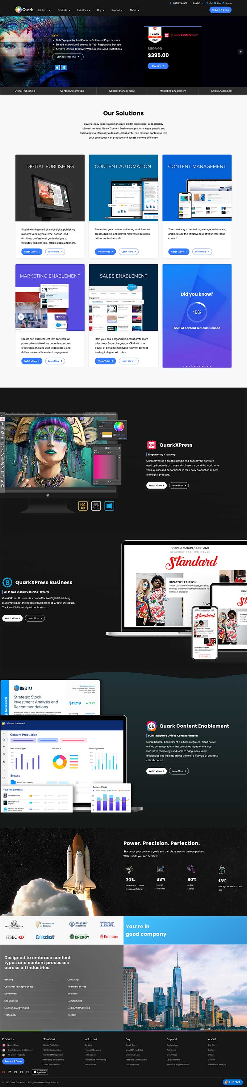
With the launch of Quark's next-generation Content Enablement Platform and a stronger-than-ever emphasis on sales and marketing via a broad customer acquisition strategy, Quark.com was due for a major revamp of it's online presence.
Results
Migrated to a modern tech-stack
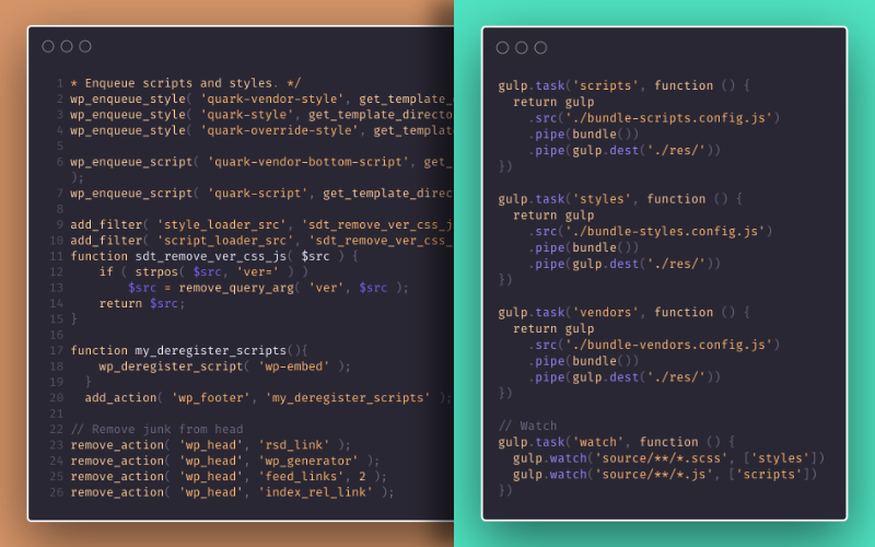
The website was migrated from ASP to WordPress. The transition included designing and developing a fully-custom WordPress theme with a highly performant and optimized codebase.
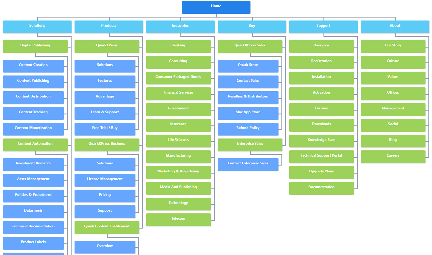
Simplified information architecture
By re-assessing and simplifying the information architecture, the website became easier to browse and consume.
Fully responsive and mobile-friendly
The website was built as mobile-first, ensuring accessibility on all devices.
Competitor analysis
Before venturing further into the project, the team decided to spend some time analysing the competition, both in the B2B and B2C space. The results were interesting, and very close to what we had imagined.
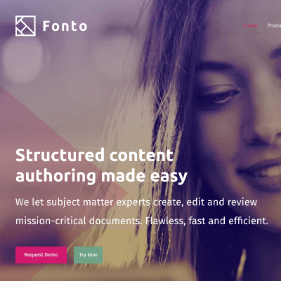
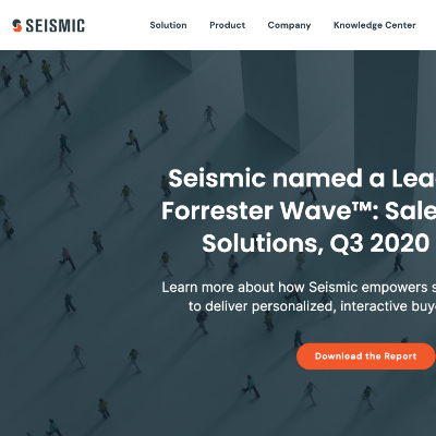
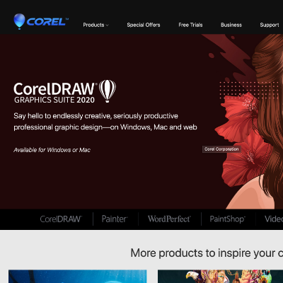
The biggest takeaway was that there was a serious need to create more content around solutions/industries/verticals and curate the journey for the customer, based on their goals. This was previously missing, and something that some of our competitors did a very good job of.
Information architecture
One of the first exercises the team started off with was to figure out all the pages we were working with (hint: there were a lot of them!) and figure out how to improve the information architecture of the website. I worked closely with the product owners and department heads to understand their priorities and intent behind each page that's on the website.
Ideation
The next step in the process was coming up with some layout ideas.
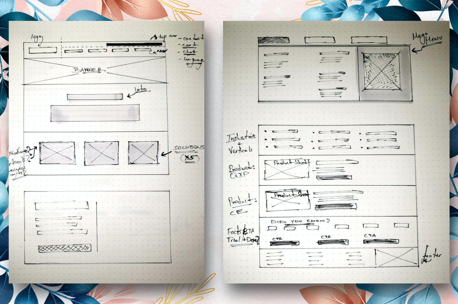
Sketching out a layout, surprisingly, was not time consuming for this project. Most likely because of the time spent really understanding what the sitemap and the information architecture What did, however take time was figuring out were things like: what the different sections are, that we wanted to present on the homepage, and the weight that it deserves, in terms of size and visual importance.
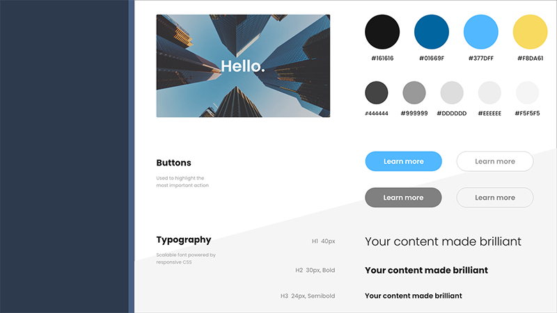
We also took this opportunity to create a style guide — nothing too fancy, just a simple document to make sure all high-fidelty designs are consistent and efficiently created.
Development
For this project, I was also leading the development of the website, along with our Web Developer.
Because of my previous experience with Wordpress' architecture and general web-optimization techniques, my goal was to kickoff the codebase and do a handover to the Web Developer. This meant setting up an optimized skeleton theme for Wordpress that the developer could work with; ensuring all Wordpress specific bloat had been removed; and setting up a simple, yet sophisticated build workflow via Gulp, which supports SASS, image optimization and resource bundling.
Solution
Want to learn more?
Hate to break it to you, but I'm no longer with Quark. Feel free to explore their website
Pssst! Case studies feel too formal? Check out Absurd Designs...
No process. All mischief.